
2027 Italian Wedding Colour Palettes: From Amalfi Pastels to Vineyard Hues
If you’ve found yourself deep in Pinterest at midnight searching “Italy wedding colour palettes 2027”, WELCOME, you’re exactly where most couples start!
Colour is one of the earliest (and most emotional) decisions in wedding planning because it shapes everything: florals, stationery, bridesmaid dresses, tablescapes, even the vibe of the photos.
The good news? Italy makes colour easy because each region already comes with a built-in palette. The coast gives you sun-washed pastels and citrus. The countryside leans into vines, stone, olive groves, and terracotta. The lakes bring cool elegance and quiet-luxury neutrals. In 2027, the shift is toward palettes that feel location-led, softly intentional, and effortlessly “Italian” rather than overly themed.
Below are the most in-demand destination wedding colours Italy couples are gravitating toward for 2027. With exact palette ideas, where they work best, and how to style them without overcomplicating it.
The 2026/2027 Italy palette direction (in plain English)
In 2027, the most “modern” Italian wedding palettes aren’t about bold colour for the sake of it — they’re about tone and texture:
Sun-faded colour (pastels that look kissed by coastal light, not candy-bright)
Earth + botanical grounding (olive, sage, vineyard greens, clay tones)
One accent colour that does the talking (citrus, cobalt, dusty rose, terracotta)
Material-led neutrals (linen, stone, limestone, travertine, ivory)
Think: effortless, Mediterranean, cinematic.
Palette 1: Amalfi Pastels
The “sun-washed coast” look.
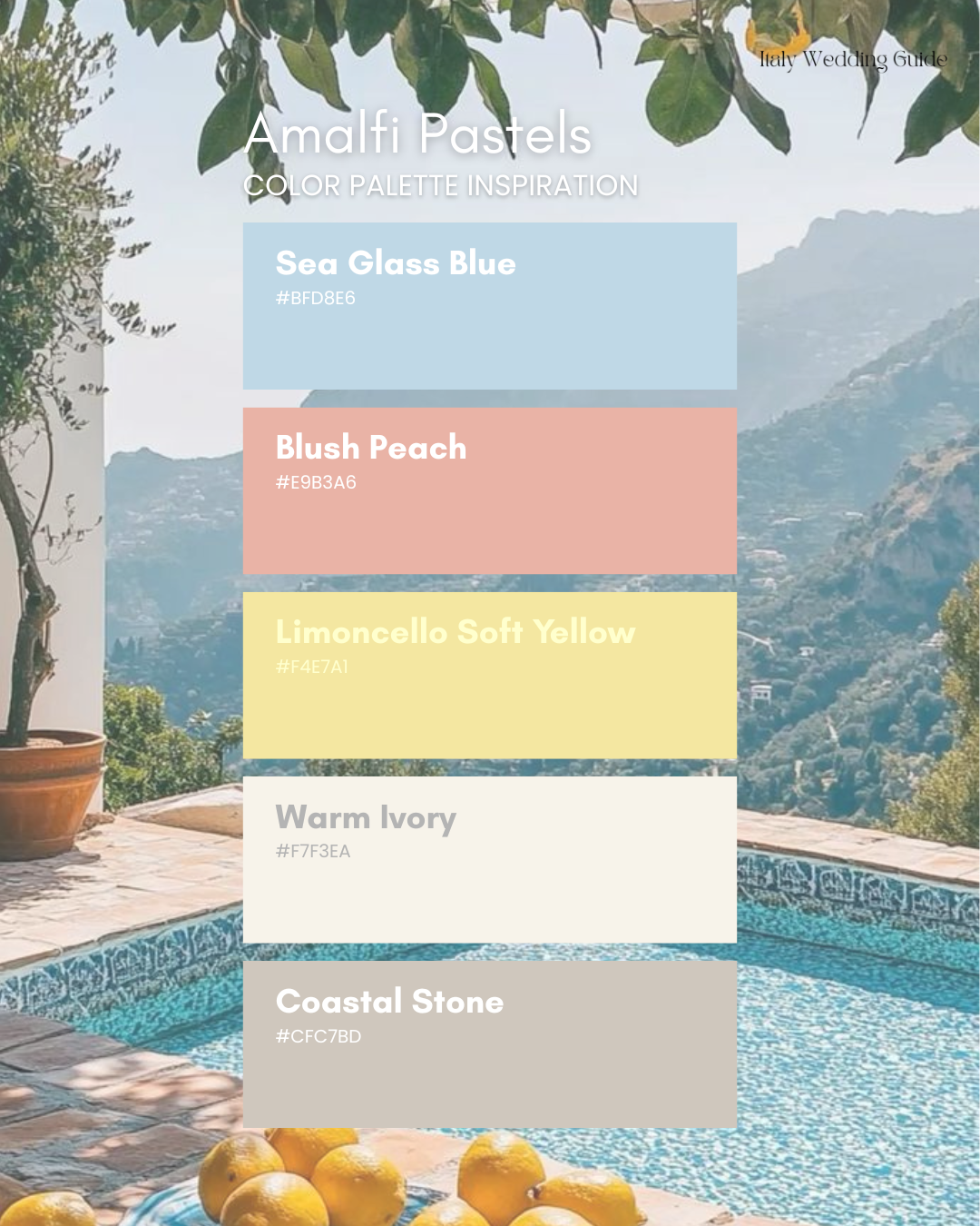
If you’re planning an Amalfi Coast wedding (or want that vibe anywhere in Italy), this is the search term couples keep saving: Amalfi Coast wedding palette. In 2027, the version of Amalfi is softer and more romantic. Less “bright lemon theme,” more “pastel seaside postcard.”
Colour notes: sea-glass blue, faded peach, warm ivory, soft stone, a whisper of limoncello.
Suggested palette (hex codes):
Sea Glass Blue — #BFD8E6
Blush Peach — #E9B3A6
Limoncello Soft Yellow — #F4E7A1
Warm Ivory — #F7F3EA
Coastal Stone — #CFC7BD
Where it works best in Italy: Amalfi, Ravello, Positano, Capri, Liguria (and anywhere with ocean views + light stone).
How to style it (without it feeling themed):
Florals: white + blush base (roses, ranunculus, garden roses) with one “sun” accent (butter yellow or pale apricot)
Table linens: ivory or sand linen (avoid stark white, it photographs harsh)
Bridesmaids: mismatched sea-glass, pale blue, and soft peach satin
Stationery: deckled ivory paper + blue-grey calligraphy + a tiny citrus motif (not full lemon overload)
Pro tip: Let the venue’s stone and sea do half the work. This palette looks best when you don’t fight the landscape.
Palette 2: Sicilian Citrus
Joyful, bold, still elegant.
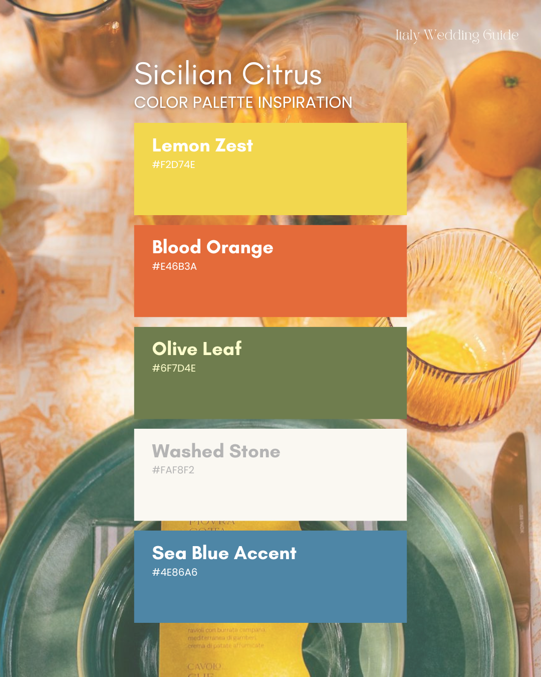
Sicily is made for colour… but the 2027 take is more curated. Instead of mixing every bright shade, couples are choosing a clean base (ivory + green) and letting citrus tones pop in a controlled way.
Suggested palette (hex codes):
Lemon Zest — #F2D74E
Blood Orange — #E46B3A
Olive Leaf — #6F7D4E
Crisp White — #FAF8F2
Sea Blue Accent — #4E86A6
Where it shines: Sicily, Aeolian Islands, Puglia, coastal Tuscany, anywhere with sun + rustic textures.
How to make citrus feel luxe (not chaotic):
Use citrus in moments, not everywhere: escort display, bar styling, place cards, aperitivo tables
Florals: white blooms + olive/greenery + pops of orange ranunculus or tulips
Glassware: swap clear for one statement colour (amber or sea-blue)
Lighting: warm bulbs + candles make bright palettes feel expensive instantly
Aesthetic shortcut: Citrus + white + olive = effortless Italy. Add blue only if your venue has sea or tile tones that match.
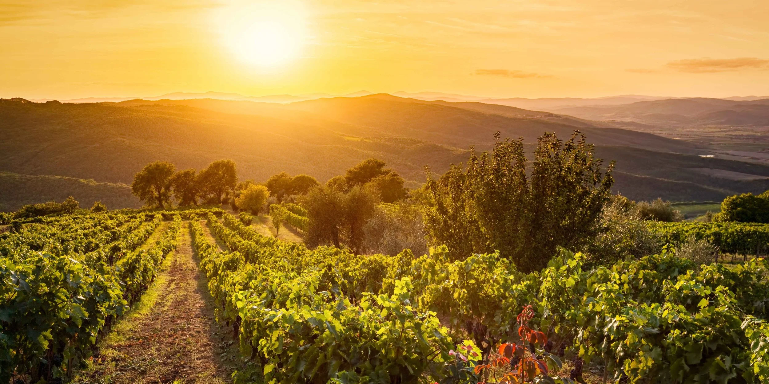
Palette 3: Tuscan Vineyard Hues
Green-forward with warm earth
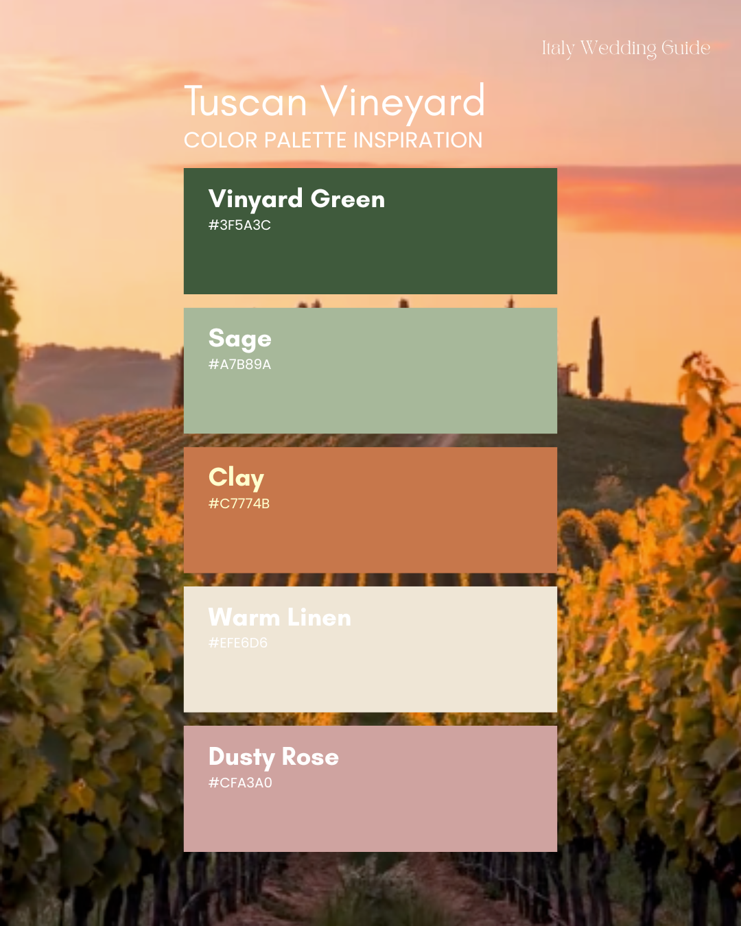
If your dream is long tables, vineyards, golden hour and that countryside calm, this is your palette. It’s also one of the most timeless options for destination wedding colours Italy, because it looks like it belongs in the landscape.
Suggested palette (hex codes):
Vineyard Green — #3F5A3C
Sage — #A7B89A
Terracotta Clay — #C7774B
Warm Linen — #EFE6D6
Dusty Rose (soft accent) — #CFA3A0
Where it works best: Tuscany, Umbria, Piedmont, Lazio countryside.
Styling notes:
Florals: lots of foliage + creamy whites + a small amount of warm blush or clay
Tableware: cream ceramics, brass cutlery, stone taper candles
Bridesmaids: sage, olive, champagne, or muted rust (avoid neon “burnt orange”)
Men: warm-toned suits photograph beautifully here (tobacco, navy, charcoal)
2027 twist: Couples are adding one unexpected soft accent (dusty rose or pale butter) to keep the palette romantic, not heavy.
✨ Planning this look?
Before you save another pin, it helps to know how Italian weddings actually work — especially when you’re planning from overseas.
The Italy Wedding Guide walks you through:
how venues and vendors really operate
what to book first (and what can wait)
timelines that can’t be moved once confirmed
realistic expectations before you commit to a region or venue
It’s the planning clarity behind the pretty pictures.
👉 Explore the Italy Wedding Guide
(Instant digital download)
Palette 4: Lake Como Neutrals + Powder Blue
Quiet luxury
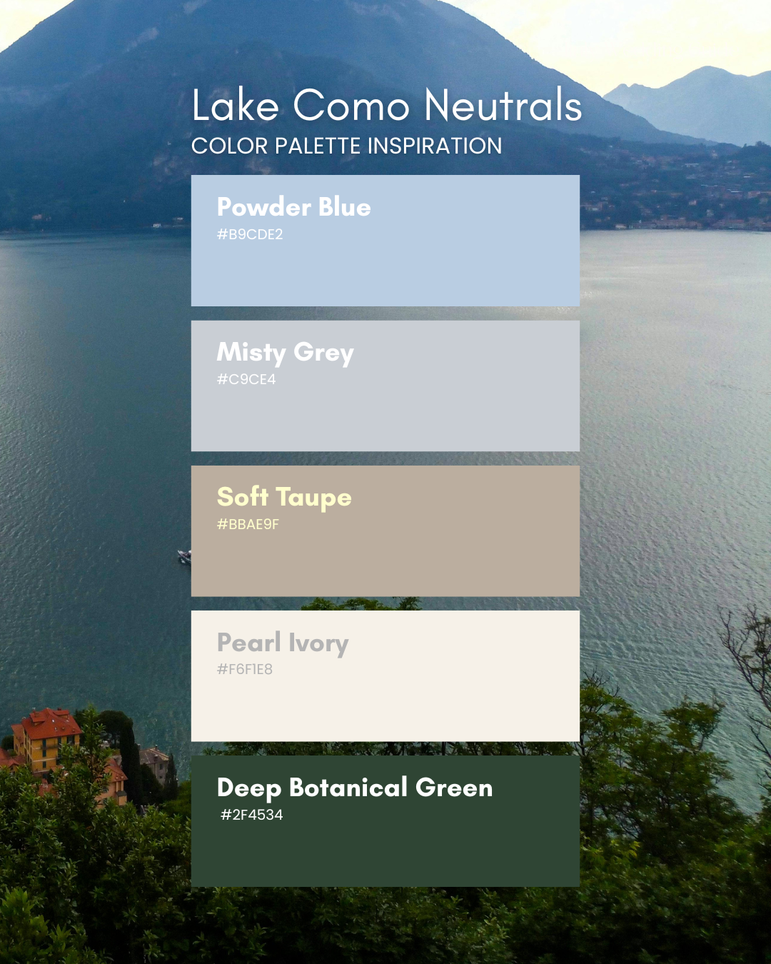
Lake Como weddings naturally lean refined. In 2027, the look is “old money” without trying: clean neutrals, silky textures, soft blues, and a bit of contrast (black tie details, deep green foliage).
Suggested palette (hex codes):
Powder Blue — #B9CDE2
Mist Grey — #C9CED4
Soft Taupe — #BBAE9F
Pearl Ivory — #F6F1E8
Deep Botanical Green — #2F4534
Where it works best: Lake Como, Lake Garda, Milan villas, and elegant garden venues.
How to style it:
Florals: white-on-white + texture (hydrangea, lisianthus, orchids) + deep green foliage
Tables: crisp ivory + minimal styling + one statement element (chandelier, candelabra, or sculptural centrepiece)
Bridesmaids: powder blue satin (classic) or champagne for a warmer take
Stationery: letterpress + embossed monograms (this palette loves restraint)
Photo magic: This palette photographs incredibly in overcast lake light — it looks expensive even when the weather is moody.
Palette 5: Venetian Chic
Cream, black, gold, and a little drama
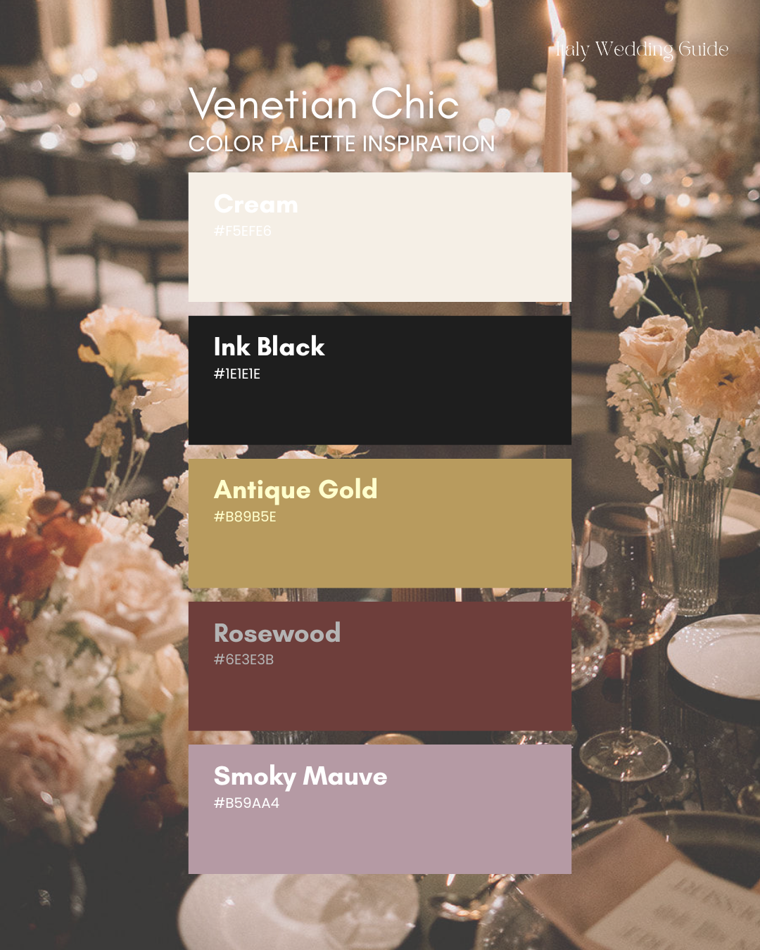
For couples getting married in Venice (or going for a fashion-forward city vibe), 2027 is bringing back elegant contrast — but with warmth.
Suggested palette (hex codes):
Cream — #F5EFE6
Ink Black — #1E1E1E
Antique Gold — #B89B5E
Rosewood — #6E3E3B
Smoky Mauve — #B59AA4
Where it works: Venice, Florence palazzos, Rome, luxury hotel weddings.
Styling cues:
Keep florals modern: fewer stems, richer tones, intentional shape
Add glow: candlelight, gold accents, champagne tower moments
Fashion: this palette suits sleek silhouettes, gloves, pearls, statement earrings
Planning a wedding in Italy? Scoll through the images to view what’s inside!
Here’s the part nobody talks about.
It’s not the dress.
It’s not the flowers.
It’s not even the venue.
It’s the small mistakes that quietly cost you thousands.
Booking a villa that needs €8,000 in external rentals.
Choosing July in Sicily without realising it’s 40°C.
Hiring a planner you don’t actually need.
Paying inflated “destination wedding” prices because you didn’t know the local way.
That’s what this guide protects you from.
This Isn’t Just a Wedding Guide. It’s a Cost-Cutting Strategy.
Created by an Italian bride who planned her own 110-guest wedding from Australia, this 80+ page guide shows you:
✔ Where you can genuinely save money (and where you absolutely shouldn’t)
✔ Which regions offer better value for your budget
✔ How restaurant venues can eliminate venue hire fees
✔ What vendors actually cost in Italy — in euros
✔ The hidden extras couples forget (that blow budgets fast)
✔ When you don’t need a €10K planner
✔ How to compare quotes like someone who knows what they’re doing
Because confidence saves money.
And confusion is expensive.
Real Example
One couple:
Avoided booking a €6,000 venue hire villa
Chose an all-inclusive Sicilian venue instead
Saved enough to cover photography + live music
The guide cost them less than one wedding favour per guest.
Inside the 80+ Pages
• Legal vs symbolic clarity (so you don’t waste time on paperwork you don’t need)
• Region breakdowns: Tuscany, Amalfi, Sicily, Lakes, Venice
• Realistic budget examples at €20K, €40K, €80K+
• Built-in budget tracker
• Vendor enquiry templates (English + Italian)
• Full Italy-specific planning timeline
• “Do You Actually Need a Planner?” section
• Buddymoon planning guide
This isn’t inspiration.
It’s prevention.
Who This Is For
Couples who:
Want a beautiful wedding
But also want to be financially smart
Don’t want to overpay because they’re foreign
Want to feel confident when vendors send quotes
Let’s Be Honest
You’re already spending tens of thousands.
Spending $120 to avoid even one €1,000 mistake?
That’s not a purchase.
That’s leverage.
Palette 6: Wild Puglia
Olive, sand, chalk white, soft sun.
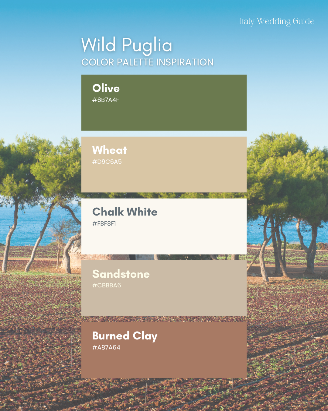
Puglia (and southern Italy generally) looks best when you echo its natural materials: limestone, olive trees, wheat tones, and sun. A wedding palette inspired by raw earth, golden sun, and quiet southern beauty.
Rooted in the rugged charm of Italy’s deep south, this palette takes its cues from olive groves, wheat fields, chalk-white Masserie, and that burnt-orange dust that clings to your sandals after a long walk through the countryside.
It’s sun-drenched but grounded. Warm but never try-hard. Think linen caught in the breeze, terracotta tiles underfoot, and soft light flickering through olive branches at aperitivo hour.
Suggested palette (hex codes):
Olive — #6B7A4F
Wheat — #D9C6A5
Chalk White — #FBF8F1
Sandstone — #CBBBA6
Burned Clay (accent) — #A87A64
Styling tips:
Think: linen, rattan, ceramics, olive branches, airy draping
Add peach only in tiny pops if you want softness without going “pink wedding.”
How to choose the right palette for your Italian wedding
If you’re stuck between three Pinterest boards (very normal), use this simple filter:
Start with the location. What colours already exist there? Sea, stone, vineyards, tiles, citrus, mountains.
Pick a base + one accent. Base = neutrals + greenery. Accent = the colour that tells the story.
Decide your “photo temperature.”
Warm, golden, earthy → Tuscany / Puglia palettes
Cool, soft, refined → Como / Amalfi pastels
High contrast, editorial → Venice chic
Translate it into 5 decisions: florals, linens, bridesmaids, stationery, and lighting. If it looks cohesive across those five, you’re done.
Quick palette cheat sheet - What’s You Vibe?
Romantic + coastal: Amalfi Pastels
Joyful + festive: Sicilian Citrus
Rustic-luxe + timeless: Tuscan Vineyard Hues
Elegant + polished: Lake Como Neutrals + Powder Blue
Editorial + fashion: Venetian Chic
Natural + sun-bleached: Puglia Stone + Olive
Final note
Your palette doesn’t need to be complicated to be beautiful. In Italy especially, the most stunning weddings are the ones that feel like they belong exactly where they are — as if the colours were always meant to be there.
If you want, send me your region + season + venue style, and I’ll tell you which of these 2027 Italian wedding colour palettes will photograph best and feel most “you.”
Plan the dream. Then plan it properly.
Italian wedding inspo is easy to fall in love with.
Planning it — especially from overseas — is where couples often get stuck.
The Italy Wedding Guide is your step-by-step roadmap to planning with confidence, not guesswork. Written from real experience, not theory.
If you want to enjoy the creative part without second-guessing every decision, this is where to start.
🤍 Get the Italy Wedding Guide 🤍
Plan once. Plan it right.
Planning a wedding in Italy? Scoll through the images to view what’s inside!
Here’s the part nobody talks about.
It’s not the dress.
It’s not the flowers.
It’s not even the venue.
It’s the small mistakes that quietly cost you thousands.
Booking a villa that needs €8,000 in external rentals.
Choosing July in Sicily without realising it’s 40°C.
Hiring a planner you don’t actually need.
Paying inflated “destination wedding” prices because you didn’t know the local way.
That’s what this guide protects you from.
This Isn’t Just a Wedding Guide. It’s a Cost-Cutting Strategy.
Created by an Italian bride who planned her own 110-guest wedding from Australia, this 80+ page guide shows you:
✔ Where you can genuinely save money (and where you absolutely shouldn’t)
✔ Which regions offer better value for your budget
✔ How restaurant venues can eliminate venue hire fees
✔ What vendors actually cost in Italy — in euros
✔ The hidden extras couples forget (that blow budgets fast)
✔ When you don’t need a €10K planner
✔ How to compare quotes like someone who knows what they’re doing
Because confidence saves money.
And confusion is expensive.
Real Example
One couple:
Avoided booking a €6,000 venue hire villa
Chose an all-inclusive Sicilian venue instead
Saved enough to cover photography + live music
The guide cost them less than one wedding favour per guest.
Inside the 80+ Pages
• Legal vs symbolic clarity (so you don’t waste time on paperwork you don’t need)
• Region breakdowns: Tuscany, Amalfi, Sicily, Lakes, Venice
• Realistic budget examples at €20K, €40K, €80K+
• Built-in budget tracker
• Vendor enquiry templates (English + Italian)
• Full Italy-specific planning timeline
• “Do You Actually Need a Planner?” section
• Buddymoon planning guide
This isn’t inspiration.
It’s prevention.
Who This Is For
Couples who:
Want a beautiful wedding
But also want to be financially smart
Don’t want to overpay because they’re foreign
Want to feel confident when vendors send quotes
Let’s Be Honest
You’re already spending tens of thousands.
Spending $120 to avoid even one €1,000 mistake?
That’s not a purchase.
That’s leverage.
Elisa Marino x
Your Italian Wedding Guide & Planning Bestie